
Email Sentiment Analysis Using Python & Microsoft Azure - Part 2
Table of Contents
Just to recap real quick, Part 1 of this series was focused on grabbing a CSV export of your email Sent Items and using Microsoft Azure’s Text Analytics API to return a sentiment result for each line.
The results that we grabbed from the API we used to increment a frequency table to essentially show us the overall count of Positive, Negative, Neutral or Unknown results.
We also found that fully understanding the timeline was difficult, as any export function from Outlook does not include Datetime data, so our analysis was just over the bulk of items we had in our Sent Items folder.
Part 2 Introduction
Since Part 1 was published, I stumbled across a new version (v3.1) of the Text Analytics API, which can return a “Mixed” sentiment result. We’ll be exploring this, as well as the following notable changes:
- Exploration of application usage details from a tool called RescueTime
- Reviewing detailed scores and output of the Sentiment Analysis results
- Prep to join datasets and find correlations
- Visualizing the data
In Part 1 I had also mentioned how Outlook itself doesn’t allow you to natively export a copy of your email (in CSV or PST format) with the sent or received dates/times included.
An alternative to opening the Outlook app and downloading the CSV is to leverage PowerShell to query and save the information. By using PowerShell we have the ability to manipulate fields not otherwise available to us in the Outlook app.
Retrieving Emails w/ Datetime Using PowerShell
The following code will pull your Sent Items folder message body and sent dates/times, then store into a CSV. Make sure to update the -path switch to whatever you want.
When reviewing the file in Excel (assuming you have default settings applied) you’ll notice some formatting issues like:
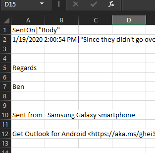
To get around this and provide a format easier to work with in Python, we’ll open a new blank Excel file, click the “Data” tab, and in the Get & Transform Data section click From Test/CSV. Select your CSV file and use the following settings:
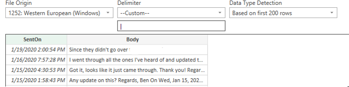
| You’ll notice we changed the delimiter to a | character, as we don’t see that used much in most email text, especially not in any emails I would have sent. |
We can also see a preview showing us it is formatted how we want it. We’ll click Load at the bottom, save this as our working CSV and now you’re ready to load it into a dataframe!
Shout out to Jason Bruno for help with the PowerShell script and modifying the format in Excel!
Downloading RescueTime Data
Photo by Stephen Phillips - Hostreviews.co.uk on Unsplash
Where did RescueTime come from? Well, about a year and a half or so ago I had downloaded an application that helps track active time spent in applications and help you find areas to cut back on, as well as just general insight into where you spend most of your time.
I used this app for about a month or so, then honestly forgot I had it installed. Oops!
To my benefit, this app was still collecting data. RescueTime provides the ability to download a copy of all of your data in CSV format (available in your profile on their website), so I knew I was going to try to incorporate that into my goal of determining trends in happiness/sadness.
Also, I am not affiliated or linked in any way to RescueTime, it was just a free app I decided to try a while ago that is interesting enough to bring into this story. :)
Loading & Reviewing Datasets
We’ll be skipping a lot of the line-by-line code in this section, as we’re using a lot of the existing code from Part 1. I’m also providing a GitHub link to the Jupyter notebook in the event you want to review, copy or modify it.
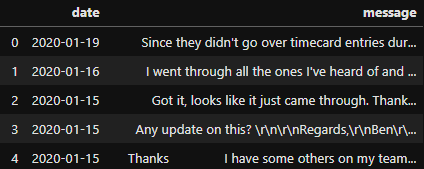
When we import our new email Sent Items export, we’ll see a lot of similarities in the data that we’ll need to clean; however, also note we now datetime data available to us. Woo! This will be very useful when visualizing and joining datasets in Part 3.
Snippets you’ll see have some general data cleaning done following a lot of steps in Part 1, with a few added such as converting the column to datetime and changing formatting a bit. I’m also continuing to learn as I go, so some code is continually being made more efficient.
After importing and doing some initial cleanup on the RescueTime dataset, here is a snippet of some information that is available to us:
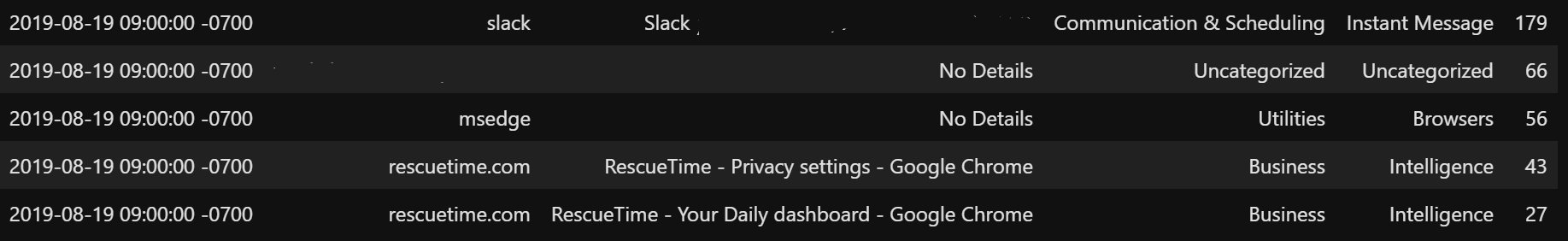
Pretty interesting that it has certain levels of detail that we can explore, but it also provides data like:
- Date recorded
- Application name
- Application category
- Usage at time of recording (in seconds)
Just for fun, here’s a visualization of my recorded active Slack instances that we’ll touch on in Part 3. Trending downward is probably an indication of when the company I work for rolled out Microsoft Teams and started to migrate away from Slack. Also, happy my Saturday usage wasn’t terrible!
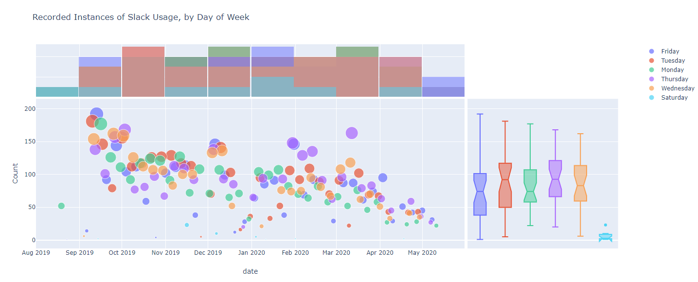
Instances recorded of the Slack window being active on my screen…
We’ll be exploring and joining with the RescueTime dataset more in Part 3, but for now we’ll shift focus to changing our Sentiment Analysis results against our new email dataset.
Sentiment Analysis Tuning
Photo by Matt Artz on Unsplash
Back on our email dataset, I’ve gone through cleaning the data using much of what we went over in Part 1, with a few additions considering we have a datetime column now.
For the sake of easier visibility, I’ve included changes to the primary sentiment analysis function(s) to return details from the API that we’ll need, as well as some modifications to the cleaned email dataset to make use of these additional features:
…and the small changes to the email dataset to take in additional detail from the sentiment analysis output. We’re using the ‘message’ Series from the DataFrame to send for analysis (compared to turning it into a list) and adding additional columns.
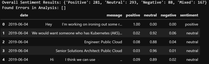
After sending our messages to the Text Analytics API we can see our results provide a similar output as found in Part 1 (including the newer ‘Mixed’ result), as well as our DataFrame having new columns with detailed sentiment scores and the overall sentiment result.
It would also be a smart time to output this result to a csv, as it takes a while to get all the results each time you send to the API. :)
Presentation Data Preparation
Photo by Andrew Neel on Unsplash
To quickly recap, some current benefits we have with our latest dataset include:
- Email sent dates
- Cleaned message details
- Detailed Sentiment Analysis score results
- Overall sentiment label
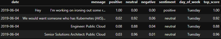
That being said, we can use our email data in it’s current state to plot, but it might be fun to also see which days of the week were more positive/negative etc.. It might also be helpful to grab the top reported score for each row.
For the sake of cleanliness, we’ll first make a copy of our email_clean DataFrame into one called email_plot, which we’ll (probably obviously) use to plot. We’ll also add a new column for the day of the week and translate from our date column.
email_plot['day_of_week'] = email_plot['date'].dt.day_name()
We’ll also do the same for getting our top-rated score, but we’ll only have it check columns related to our score outputs.
email_plot['top_score'] = email_plot[['positive','neutral','negative']].max(axis=1)
Now we have some additional interesting data we can use when plotting!
Visualizing New Data
Now that we have our data with a decent cleaning effort on the message column, added columns for our sentiment scores, overall sentiment result, day of the week and a top score, we’re ready to plot!
Recently, I’ve been focused more on Plotly as I feel it is much easier modifying layouts, color maps, etc. in comparison to MatPlotLib. MatPlotLib is definitely still a great library, but I also plan on publishing some of this on my personal site, so an interactive library made more sense.
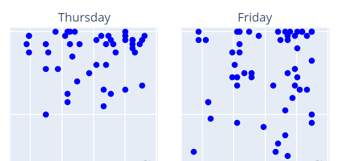
With that being said, Plotly has the ability to easily split a plot into panels using facet_col when generating your plot. After doing some tweaks to the plot details I have a fun scatter plot to look at:
If you’re new to Plotly you can filter the scatter plot above by clicking the sentiment result in the right side legend.
If we filter to only show Positive results first we can actually see what looks to be more emails flagged confidently on Thursdays and Fridays as we moved from July 2019 to July 2020.
If we switch to Negative results we can see the amount of negatively labeled emails sent on Mondays drastically reduced, with 0 negative emails on Mondays in the last quarter!
However, the opposite is true for Tuesdays (mild increase) and Wednesdays, as we can see a tighter cluster of points as we progressed into mid 2020.
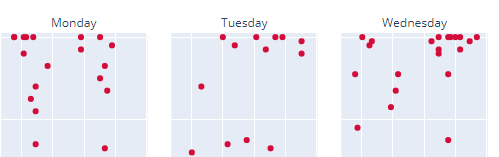
Negative Emails (left) and Positive Emails (right)
It is also interesting that any emails sent on weekends seem to be mostly positive, which might be contributed to general weekend happiness playing a role in my responses.
Conclusion
While this isn’t meant to be 100% accurate in terms of sentiment results and overall data cleanliness, it is definitely a step in a better direction and ability to start to see how my email sentiment is trending. I think it is also worth mentioning that a Negative sentiment doesn’t mean you’re being a total jerk or swearing someone out (I’m not that bad of a person…), but rather certain words used in series that may trigger the API to result in adding to the Negative response score. :)
As usual, please leave any comments/thoughts/feedback in the comments section below. I am always looking for more efficient ways to do something, errors in something I may have done along the way, or general feedback!