Univariate & Multivariate Linear Regression - Cancer Mortality Rates
Table of Contents
Full disclosure: There is a lot of code behind this article, much of which won’t be included here. For full details please review the notebook. If you have any feedback, find any errors in process or code, or just want to chat please send me a message! I’m always looking for areas to improve.
Also - if anyone happens to know how to achieve true syntax highlighting in LinkedIn code snippets, PLEASE reach out!
A Brief Introduction
I initially stumbled upon this dataset on data.world and thought it would be fun to play around with it to see what we can do. I’m still swamped with constant learning (currently converting Python knowledge to learn R), so this is far from “production ready” and is meant to be fun and educational for those of us newer to this field.
With that said, lets jump right in!
Dataset Features & Descriptions
To keep from convoluting this post, for descriptions of the dataset features I would reference the data.world link above, or see the entire Jupyter Notebook in my Github.
To boil down what we’ll be using to train our model, we’re going to use the feature TARGET_deathRate as the dependent variable that we’re trying to predict, and the below features as the independent variables. While it may be self explanatory, the independent variables are what impact the outcome of the dependent variable.
- incidenceRate (Mean per capita (100,000) cancer diagnoses)
- PctPublicCoverageAlone (Percent of county residents with government-provided health coverage, alone)
- povertyPercent (Percent of populace in poverty)
Python Library Selection
Pandas - Used for dataframe generation, manipulation and general data exploration. Provides the bulk of the heavy lifting.
NumPy - Numerical package that will mostly just be used for taking the square root for model performance.
Matplotlib - Used for data visualizations for model results.
Seaborn - Nice data visualization library based on Matplotlib. Using mostly to provide a heatmap.
MissingNo - Using for a nice visualize representation of missing values
Sci-kit Learn - Library that is providing our linear regression models. Also provides ease of train/test data splits.

Exploring Missing Data
By loading the data into a Pandas dataframe, we can check the shape and see that we have 3,047 observations (rows) and 34 features (columns). As mentioned before, we’ll only be using 3 features to help predict our target variable.

Now that we’ve loaded the data, we’ll take a look at missing values. I’m including the use of the Missingno library just to show an easy way to visually represent missing values, but we’ll also verify counts using Pandas.


The above image using Missingno represents missing values for each feature. The gray represents available data, while the white represents missing values. Based on this, we can tell that the three features with missing data are: pctsomecol18_24, pctemployed16_over, pctprivatecoveragelone.
When evaluating missing values, we’re presented with a few choices of what to do:
- Do nothing
- Imputation
- Replace with zeros or some other constant
- Drop the feature or observations with missing values
There are many pros/cons to each of these, and require a deeper understanding of the overall impact based on your decision. This should not be taken lightly. For the sake of fun and not depending on this data, we’re going to impute the missing values using the mean of the feature.
We can see below we have NaN entries (“Not a Number”) and will be filling those with the mean.

To replace values with the mean we’ll use:
df.fillna(df.mean(),inplace=True)
We can now compare the features with NaN values to our filled data:

Exploring Correlations
To help in finding strong relationships between our target feature (dependent variable) target_deathrate and other features (independent variables), we’ll explore correlation coefficients. Correlation coefficients have a range from 0 to 1, with the greater value describing a stronger relationship. For this article we’ll be using Pearson correlation.
An initial review shows us that our top three correlated variables are incidencerate, pctpubliccoveragealone, and povertypercent. As a quick reminder of what these mean:
incidencerate: Mean per capita (100,000) cancer diagoses
pctpubliccoveragealone: Percent of county residents with government-provided health coverage alone
povertypercent: Percent of populace in poverty
In looking at these, we can feel a bit more confident that there is a correlation to cancer mortalities. Always remember, correlation does not imply causation.


Linear Regression Model Training
Simply put, for univariate linear regression we’ll use a single independent variable. For multivariate we’ll use more than one independent variable, specifically three in this scenario. To get started, we’ll assign the features to X and y, which we’ll then use Sci-kit Learn’s TrainTestSplit module to split our features into nice and even training and testing data. We’ll use this to train our model.
Disclaimer: Snippets in this section may show variable reassignment to help keep article length low and for simplicity sake.

Splitting our features into training and testing data, then feeding our independent and dependent variable training data into the model.

As you can see, using a single independent variable our coefficient of determination (square of correlation coefficient) is .18 on a range of 0 - 1. This is definitely less than ideal, but we’ve also done very little with the data or finding ways to tweak the model. For the sake of this article we won’t be diving deeper into finding ways to increase our model’s score.
If we follow the same process, but creating a multivariable model, we can see our score has increased to .40 on a scale of 0 -1. By including additional features to help predict the target variable we’re able to increase our model’s score.

Model Output & Accuracy
Univariate: Now that we have trained our univariate and multivariate models using our training data, we can pass in our test data and store it in a new variable for prediction outputs. We can then compare our y_test data (actuals) with our y_pred data (predicted) to see how well our model performed. As you can see, we had some significant differences. For example, row 3 (index 2) has a significant difference.

Multivariate: We can follow the same process for our multivariate model results to take a quick glance at the difference between actuals and predictions. At first glance it looks like our predictions don’t show extreme differences like those found in our univariate model.

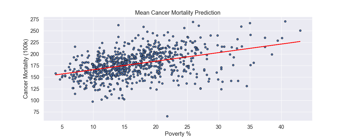
Plotting The Results
To finish this out, we can visualize our results. Using our univariate model, we can visualize the results. The circles represent the actual data and the line being our linear regression’s line of best fit (using Ordinary Least Squares).

We can also visually compare our univariate and multivariate model using a bar chart:

Thank you!
Hopefully you found this fun and provided a little insight into a process of training a model. Many of the sections in this article can go much deeper and are not explored to keep this as simple and easy to digest as possible. If you have any feedback, questions, thoughts, etc. please reach out!